You’ve seen them everywhere—sleek emblems on billboards, screens, and packaging, designed to be memorable, simple, harmless. But look just a moment longer and the familiar starts to shift: a curve feels like an eye, a line hints at a number, and the design takes on a quiet weight.
It’s easy to brush off as imagination, but symbols have always carried deeper meaning—through religion, art, power, and identity. In corporate design, where every shape is intentional, noticing these details isn’t paranoia. It’s paying attention to what might be layered beneath the surface.
Let’s look a little closer—together.
The Signal Beneath the Noise
In “How to Spot Hidden Symbols in Corporate Logos,” the core message is this: logos are more than just branding—they’re layered with meaning. To decode them, focus on three things: negative space (like the arrow between the “E” and “x” in FedEx), hidden shapes or numbers (triangles, eyes, or 666-claims), and cultural or historical motifs (pyramids, eyes of providence). The article dives into the tension between clever design Easter eggs and conspiracy-laden symbolism, reminding us that sometimes a hidden arrow is just a hidden arrow—and other times it might hint at something deeper.
Summarize this content with AI
Roots in the Shadows of History
The roots of this fascination trace back to ancient times, when symbols weren’t just decorative but loaded with meaning.
Think of the Eye of Horus in Egyptian lore, a protective amulet against evil, its falcon-like gaze symbolizing vigilance and royal power.
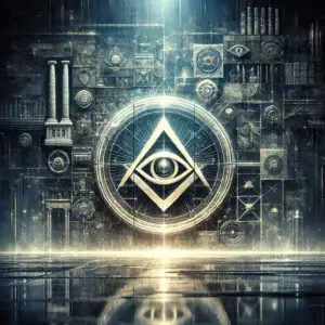
Fast-forward to the Renaissance, and that motif evolves into the Eye of Providence—a radiant eye within a triangle, representing divine oversight in Christian art. Paintings like Jacopo Pontormo’s Supper at Emmaus from 1525 feature it prominently, the triangle nodding to the Holy Trinity, rays of light beaming out as God’s benevolent watch.
But symbols don’t stay static.
By the late 18th century, the Eye of Providence pops up in secular contexts, like on the Great Seal of the United States in 1782, hovering over an unfinished pyramid of 13 steps to signify strength and the nation’s divine favor. No secret societies involved there—just Enlightenment ideals.
Enter the Bavarian Illuminati, a short-lived group founded in 1776 by Adam Weishaupt, aimed at promoting reason over superstition. They borrowed from Freemasonry, which had adopted the eye as a nod to the “Great Architect” of the universe. The Illuminati disbanded by 1787, but whispers of their survival lingered, fueled by anti-Masonic fears in the 19th century.
Conspiracy theories exploded in the 20th century, tying these symbols to hidden elites plotting global control. Books like John Robison’s Proofs of a Conspiracy in 1798 linked Freemasons and Illuminati to revolutionary upheavals. Fast-forward to the internet age, and forums buzz with claims of occult emblems embedded in everyday brands. It’s a blend of semiotics—the study of signs—and cultural anxiety, where a simple logo becomes a gateway to deeper, darker narratives.
The Art of Seeing What’s Hidden
So, how do you actually spot these hidden symbols?
Start with the basics: negative space. That’s the empty area around and between shapes, often where designers tuck clever surprises.
Take FedEx—between the ‘E’ and ‘x’, an arrow points right, symbolizing speed and forward motion. Innocent enough, a nod to their delivery prowess.
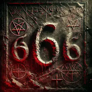
But apply the same lens to something edgier, like the Proctor & Gamble logo from the 1930s. Conspiracy theorists claimed the man’s beard curls formed three 6’s—666, the biblical “number of the beast.” P&G denied it, suing rumor-spreaders, but the panic during the Satanic scare of that era stuck.
Rotate the logo next.
Sometimes, a turn reveals the unexpected. The old Office of Government Commerce mark, when flipped 90 degrees, morphs into a suggestive figure, sparking unintended controversy. Or consider Vodafone: its red droplet, to some, twists into three 6’s when viewed sideways, linking it to apocalyptic lore. Official story? It’s a speech bubble. But in conspiracy circles, it’s a deliberate occult wink.
Look for recurring motifs tied to ancient esoterica.
Triangles and pyramids scream hierarchy and enlightenment—or control, depending on your view. The CBS eye logo echoes the Eye of Providence, a standalone gaze that’s been called an Illuminati staple. AOL’s old triangle with an eye inside? Straight from the playbook. And pyramids? Fiat’s logo subtly forms one, while the Paramount Pictures mountain could be seen as a veiled ziggurat, ancient symbols of ascent to power.
Numbers hide in plain sight too.
The Monster Energy logo’s three claw marks resemble Hebrew vavs, each equaling 6—hence 666. A viral video from 2014 claimed the brand promoted Satanism, pointing to the cross in the ‘o’ turning upside down when you drink. Monster dismissed it as nonsense, but the theory racked up millions of views. Similarly, Google Chrome’s swirling colors have been twisted into a 666 spiral by online sleuths, tying tech giants to biblical prophecy.
Animals and figures add another layer.
Owls symbolize wisdom but also secret knowledge in Illuminati lore—spot one in the Mac’s Milk logo, winking with one eye closed. Alfa Romeo’s serpent devouring a man? Rooted in medieval heraldry, but some see reptilian overlords, echoing David Icke’s theories. Disney’s signature? Theorists flip it to reveal three 6’s in the loops, accusing the company of subliminal occultism in films like Fantasia.
Don’t forget colors and symmetry.
Red often signals power or danger—think Vodafone again. Bilateral symmetry might mimic Masonic compasses and squares. The London 2012 Olympics logo? Jumbled shapes that, to critics, spelled “Zion” or resembled a swastika, prompting Iranian boycotts over alleged pro-Israel plots. Designers called it abstract energy; skeptics saw Zionist cabals.
Hidden letters form words or shapes.
Baskin-Robbins’ pink ‘BR’ hides a ’31’ for their flavors. Wendy’s collar spells “mom,” evoking home-cooked comfort. But push it further: the Airbnb logo’s loops have been mocked as resembling genitalia or a heart—unintended, but fueling memes about hidden agendas.
There are several other notable examples…Check out this great video that breaks them down.
Worth the watch.
The Other Side of the Mirror
These claims aren’t monolithic. Interpretations vary wildly.
To graphic designers, hidden elements are Easter eggs, clever ways to embed brand stories. Lindon Leader, creator of the FedEx arrow, aimed for subconscious impact, not secrecy. Amazon’s smile-arrow connects A to Z, touting variety with a grin. Unilever’s ‘U’ packs icons of their products—birds, hearts, waves—symbolizing everyday life, not occult rites.
Skeptics point out pareidolia: our brains’ knack for seeing patterns where none exist, like faces in clouds.
The P&G saga? Curls were just artistic flourishes; the lawsuit squashed rumors by the ’90s. Vodafone’s “666”? A stretch from quotation marks. Even the Eye of Providence on the dollar bill—added in 1935—is more about national heritage than elite signals. Historians like Matthew Alford argue these theories distract from real power structures, like corporate lobbying, by chasing phantoms.
Yet, believers counter with patterns too coincidental to ignore.
Why do so many logos feature eyes, pyramids, or 666 variants? From CERN’s interlocking rings (seen as 666) to the World Economic Forum’s globe (twisted into satanic geometry), they argue it’s signaling among the powerful. Pop culture amplifies it—Jay-Z’s Roc-a-Fella hand sign, a diamond, gets called an Illuminati pyramid. Madonna’s videos flash eyes and triangles. It’s a feedback loop: symbols gain power through repetition, whether intentional or not.
Echoes in the Modern Maze
Debates rage in online forums and books.
On one side, design purists decry conspiracy nuts for ruining clever work. On the other, theorists like Vigilant Citizen dissect logos as mind control tools, linking them to MK-Ultra or ancient mystery schools. Respect both: designers craft with intent, but cultural baggage loads symbols with unintended weight. The Bavarian Illuminati may be gone, but their ghost haunts modern branding, turning logos into Rorschach tests for societal fears.
Why does any of this matter today?
In an era of surveillance capitalism, where algorithms track every click, spotting hidden symbols taps into a deeper unease. Logos aren’t just ads—they’re psychological anchors, shaping perceptions subconsciously. Edward Bernays, father of PR, drew from Freud to manipulate masses; hidden elements could be his legacy, embedding loyalty or fear.
Culturally, it’s a rebellion against opacity.

With wealth inequality soaring, theories about elite symbols offer a narrative of resistance—decoding the matrix, one logo at a time. Psychologically, it satisfies our need for meaning in chaos. As Carl Jung noted, symbols bridge conscious and unconscious, revealing archetypes like the all-seeing eye as eternal watchers.
Personally, it’s empowering.
In a world bombarded by brands, training your eye fosters skepticism, a quiet defiance against passive consumption. You start questioning not just logos, but narratives around them—who benefits from the hidden, and why?
But here’s the rub: maybe the real symbol is the search itself.